Djangoでjqueryによるグラフ表示する方法
Djangoでjqueryによるグラフ表示する方法をご紹介します。
ここではChart.jsを使用した例を示します。
条件
- Django 2.1.2
- Python 3.7.0
urls.pyの設定
トップ画面に一覧画面を表示し、詳細画面にグラフを表示するという動作とします。
from django.urls import path
from . import views

app_name = 'monitor'

urlpatterns = [
    # トップ画面
    path('', views.IndexView.as_view(), name='index'),

    # 詳細画面
    path('monitor/<int:pk>/', views.DetailView.as_view(), name='detail'),
]
views.pyの設定
get_context_dataを定義し、contextでviewにデータリストを渡すようにします。
from django.http import HttpResponse
from django.views import generic
from .models import Location, Greenhouse
from django.contrib.auth.decorators import login_required
from django.contrib.auth.mixins import LoginRequiredMixin
import io

class IndexView(LoginRequiredMixin, generic.ListView):
    model = Location
    paginate_by = 5
    ordering = ['-updated_at']
    template_name = 'monitor/index.html'


class DetailView(generic.DetailView):
    model = Location
    template_name = 'monitor/detail.html'


    def get_context_data(self, **kwargs):
        context = super().get_context_data(**kwargs)  # はじめに継承元のメソッドを呼び出す

        # TODO: 本当はpkを基にしてモデルからデータを取得する。
        data = [12, 19, 30, 50, 20, 30]
        context['greenhouse_data_list'] = data

        return context
detail.htmlの設定
data: {{ greenhouse_data_list }},でviewから渡されたデータリストをセットしています。
{% extends 'base.html' %}
{% block content %}
<h1>{{ object.name }}</h1>
<section class="post-text">
{{ object.memo|linebreaksbr }}
</section>
<section class="post-date">
<p>Created: {{ object.created_at }}<span>/</span>Updated: {{ object.updated_at }}</p>
</section>
<script src="https://cdnjs.cloudflare.com/ajax/libs/Chart.js/2.7.3/Chart.bundle.min.js"></script>
<canvas id="myChart" style="width: 100%; height:300px;"></canvas>
<script type="text/javascript">
var chartChart = document.getElementById("myChart");
new Chart(chartChart, {
type: 'bar',
data: {
labels: ["Red", "Blue", "Yellow", "Green", "Purple", "Orange"],
datasets: [{
label: '# of Votes',
data: {{ greenhouse_data_list }},
backgroundColor: [
'rgba(255, 99, 132, 0.2)',
'rgba(54, 162, 235, 0.2)',
'rgba(255, 206, 86, 0.2)',
'rgba(75, 192, 192, 0.2)',
'rgba(153, 102, 255, 0.2)',
'rgba(255, 159, 64, 0.2)'
],
borderColor: [
'rgba(255,99,132,1)',
'rgba(54, 162, 235, 1)',
'rgba(255, 206, 86, 1)',
'rgba(75, 192, 192, 1)',
'rgba(153, 102, 255, 1)',
'rgba(255, 159, 64, 1)'
],
borderWidth: 1
}]
},
options: {
scales: {
yAxes: [{
ticks: {
beginAtZero:true
}
}]
}
}
});
</script>
<section>
<p><a href="javascript:history.back()">< Back</a></p>
</section>
{% endblock %}
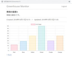
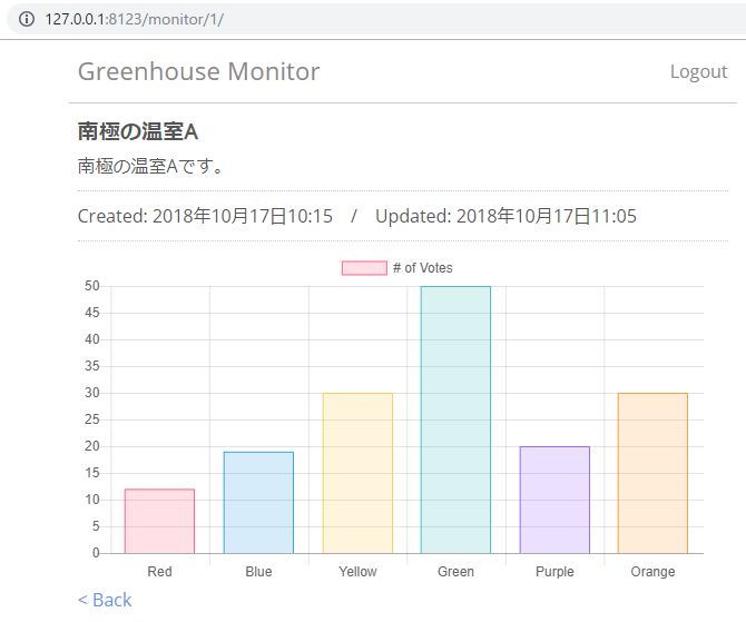
表示例
詳細画面を開くと、以下のように表示されます。
参考
Chart.jsの詳細は以下のサイトを参照してください。
http://www.chartjs.org/docs/latest/